How Psychology Of Color Affects Your Products Branding?

Ever visited Domino, Pizza Hut, or McDonald’s? Don’t shy away speak it up, no one’s going to count on your calories here. Have you ever noticed the color specifications used by these world-famous brands?
Dominos uses Blue, Pizza Hut uses Red (Spicy red to be more precise) and MCD uses a red mix of yellow. Do you know the reason behind this practice? THESE COLORS INCREASE YOUR APPETITE. OH, now you know how your bills cross your limits?
Color psychology belongs to a broader field of behavioral psychology. But yes, it is a pretty complicated field. Still, that doesn’t keep you away from exploring it, as the gap needs to be filled. Color is a critical subject but a brands success depends upon how they use color. It is a must read topic for product designers, packaging designers, general managers, architects, store owners etc.
Going deep into the psychology,
“Color wields a magic over our attitudes and emotions. When our eyes stuck on a product the first thing they notice and take in is a color, the color then communicates with the hypothalamus (a region of the brain), which in turn sends a flood of signals to the pituitary gland, on to the endocrine system, and then to the thyroid glands. The thyroid gland signals the release of the hormones which in return causes the fluctuation in mood, emotion, and resulting behavior of an individual.”
What do colors tell about your brand or the product?
Red:
It generates urgency so it is a necessary element when triggering sales.
There have been reports that suggest red CTA button worked more efficiently than a green CTA button.
Increases appetite that’s why it is used by the fast food chains.
Is a preferred color for fast cars and lingerie, as it raises excitement.
Brands like; Netflix, Coca-Cola, Pinterest, Levi’s, H&M and others use red for their logo.
Blue:
The most preferred color for men.
Generates a calming effect on the mind.
It symbolizes strength, wisdom, trust, dependability.
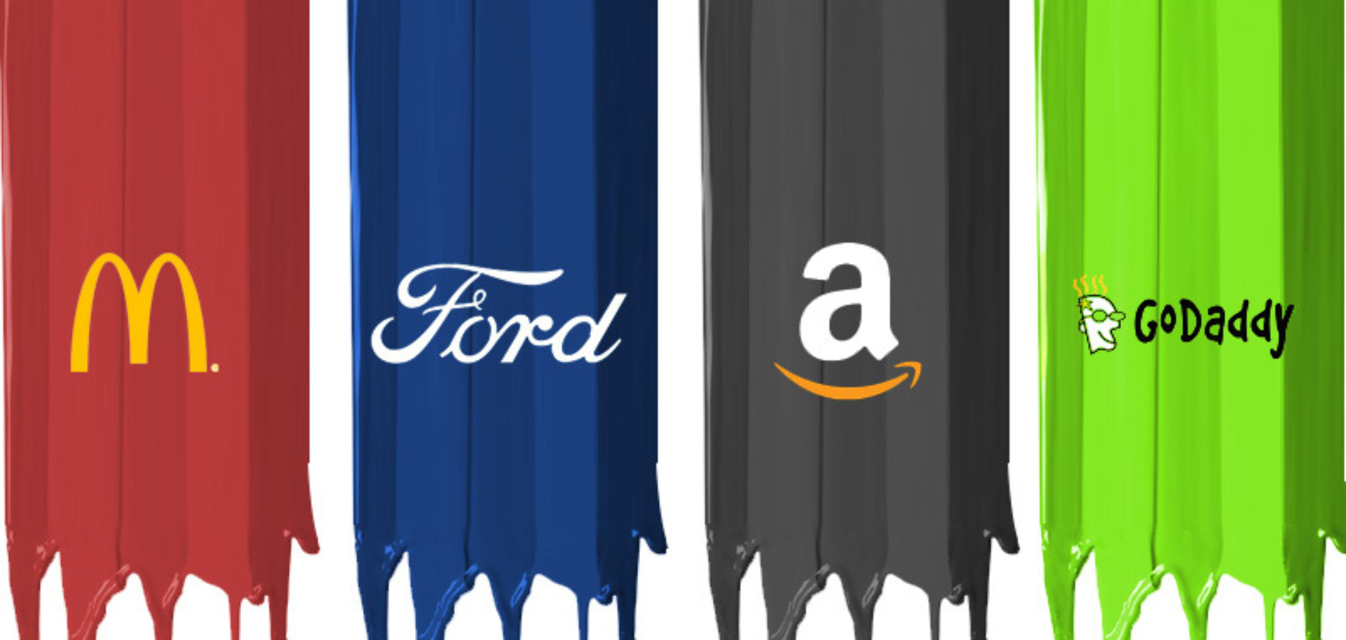
Brands like; Facebook, Paytm, Ford, Volkswagen use blue aggressively and that is why we as a customer have great trust in them, isn’t it?
Yellow or Orange:
Orange is associated with the sun so it generates a warm feeling.
Suits a non-corporate brand as it is considered bright, light and funny.
Yellow and orange are cheerful colors and they promote optimism.
Brands like; Amazon, Continental Tires, Harley-Davidson, KTM (Black with Orange) and others use orange to full perfection. Whereas, Yellow is for warning signs like; Wet Floor, Road symbols, DHL, Ultratech Cement etc.
Black:
Black is powerful which is the synonym for luxury and power.
If added with another color it brings sophistication with power.
Suited for the fashion, automobile and cosmetics industry but not for health or food industries.
Brands like; Nike, Hugo Boss, WWF, Accenture have used black to full extension.
Grey & White:
Grey and White are for a modish look and feel.
But the design should be top-notch as bad designs can make it look lazy and lack power.
It showcases cleanliness, innocence, purity, simplicity and pristine.
Logos like; Make in India, Apple, Sony, Burberry, Mini Cooper have played fairly with white and grey.
Purple:
Purple has been the color of royalty.
It is mostly known as a feminine shade.
If you want a prestige positioning of your brand, Purple is a go.
Brands like; Yahoo, Cadbury, Hallmark have used purple as their main color.
Apart from these, there are various other colors which have their own significance. For instance, Green makes you close to nature and is associated with health, tranquility, power. Colors are very tricky things; hence you should use them in the same way. According to Digital Marketer, Neil Patel, Color is 85% of the reason you purchase a specific product.
If you are targeting women you should try playing with;
Blue, Purple, and Green Try avoiding Orange, Brown, and Grey.
In the case of men you should go with; Blue, Green and Black, but never present Brown, Orange or Purple, chances are that you might lose them.
From the customer’s point of view, the next time you buy a product think about the metrics which go beyond deciding a color. From a brand’s perspective, be more precise while choosing a color as logos, designs don’t change every day.
Have a colorful day.
DISCLAIMER: This article and the points are based on the behavioral of the customers and don’t have a backing of any scientific research or survey.
Facts sources: Kiss metrics & entrepreneur.com
Read more: 10 Tips to Improve Your Ecommerce Website


